CSS Baby Shower Card
May 16, 2020
A few weeks ago, I attended a baby shower on Zoom.
Under past circumstances, I would have spent 20 minutes in the card aisle at a store perusing and selecting the perfect card for such an occasion, but times are different now and I couldn’t do that.
Instead, I decided to make my own digital card for the baby shower using CSS. (I thought the medium fit the venue nicely.)
Here’s the final result:
Ok cool, but what did I learn?
Originally I wanted the card to have a rotated X axis to give the effect that it’s lying on a flat surface and then transition to appear upright when the card opens. The (simplified) code to do that looks something like this:
.card__container {
    perspective: 1400px;
}
.card {
    transform:rotateX(65deg);
    transition: all 1s ease;
}
.open .card {
    transform:rotateX(0deg);
}
This worked pretty great in my initial greeting card prototype and I thought it added a nice bit of depth to the card opening animation.
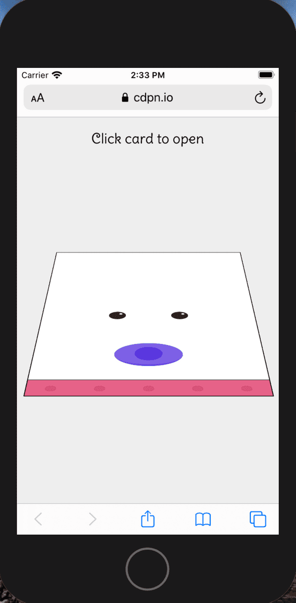
However, once I layered in the animated baby code I noticed something weird was happening in iOS.
Where did the baby go?
After much debugging and googling, I learned a few things about transforms and positioning:
-
According to the W3C spec on CSS Transforms:
“any value other than none for the transform property also causes the element to establish a containing block for all descendants. Its padding box will be used to layout for all of its absolute-position descendants, fixed-position descendants, and descendant fixed background attachments.”
As I understand this, a parent element with a transform property that is not none becomes the positioning context container for any positioned child elements, it’s as if it’s given a position:relative. Child elements with position:fixed behave as if they have position:absolute.
Therefore, the following code behaves the same:
<style>
   .card {
       transform: rotateX(0deg);
   }
   .card__panel {
       position:fixed;
       top:0;
       bottom:0;
       left:0;
       right:0;
   }
</style>

<div class="card">
   <div class="card__panel card__panel--front">
   </div>
   <div class="card__panel card__panel--inside-left">
   </div>
   <div class="card__panel card__panel--inside-right">
   </div>
</div>
As this code:
<style>
   .card {
       position:relative;
   }
   .card__panel {
       position:absolute;
       top:0;
       bottom:0;
       left:0;
       right:0;
   }
</style>

<div class="card">
   <div class="card__panel card__panel--front">
   </div>
   <div class="card__panel card__panel--inside-left">
   </div>
   <div class="card__panel card__panel--inside-right">
   </div>
</div>
Helpful in better understanding, but this didn’t solve my problem.
-
The other piece of wisdom I picked up from the W3C spec is:
“any value other than none for the transform property results in the creation of a stacking context. Implementations must paint the layer it creates, within its parent stacking context, at the same stacking order that would be used if it were a positioned element with z-index: 0. If an element with a transform is positioned, the z-index property applies as described in [CSS2], except that auto is treated as 0 since a new stacking context is always created.”
My takeaway from this is the transform property creates a new stacking context. Between the card animation and the baby animation I have a lot of transforms being applied, so each one may create a new stacking context and reset any applied z-index values. This helps me understand why the pacifier and eyes still display in the screenshot (they each have their own transform properties applied), but the rest of the baby’s face does not.
In the end, I opted to remove the parent transform and keep the rotation consistent to solve my problem. Armed with this new knowledge, I probably could have refactored my code to get it rendering as expected, but I was short on time and convinced myself it was easier to read the card this way anyway.
In the end, this was a fun little project to work on and helped me deepen my understanding of the transform property and its relationship to positioning elements.
